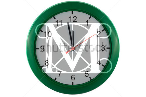
Time's almost up, old "M"
So it seems my company will have a new logo as of March 1 …
And it seems there's been a bit of controversy about it.
In the full disclosure department:
- I work at The Met
- I had nothing to do with the new logo.
- As a longtime typesetter I don't think it's the greatest thing ever in and of itself.
- BUT … it's fine. (As was the old logo.)
- AND … in a year or two no one will really care.
- MOST IMPORTANTLY … I completely agree with the Met's larger reasons for this new logo, in terms of clarity, identification, brand recognition, and reaching out to audiences who don't think of the Met as their kind of place. Criticism of the new logo and the effort behind it has been pretty elitist (creative-class professionals, regular Met-goers, people who deeply know the difference between The Met Museum and the Met Opera, etc. I'm part of this elite, whether I like it or not). This elitist idea was a purposeful part of the Met's identity for several decades. The idea that a new logo represents a rush to a lowest common denominator (emphasis, intentional or not, on common) is ludicrous. The Met isn't selling its soul; it's trying to make people feel welcome who haven't felt welcome before, no matter the strong visitor numbers that come from being—let's face it—a destination for tourists and school groups who don't have any particular love for the institution, but who come because it's a check-off box on an itinerary. So, if a few tilted serifs make you feel like art and culture and all that is good in the world is not only merely dead, but really most sincerely dead, then, to quote Louis C.K., "will you give it a minute?"
Here's The Met's own statement about the logo, in response to the negative coverage.
Here are some takes and takedowns:
Pro-ish (or neutrally noting the controversy):
Con-ish (whether about the logo or The Met's professed strategy behind it):
- New York mag/Vulture
- Huff Po
- Altrevolution
- From the Brand New blog of the design firm Under Consideration.


